
CI & Mascot
Our corporate identity stands for friendship and trust. Its two signature colors, red and blue, reflect a company whose products are built on those values and evoke the brightness and richness of nature. Clear-space rules around the logo keep it legible and free from competing elements or busy backgrounds.
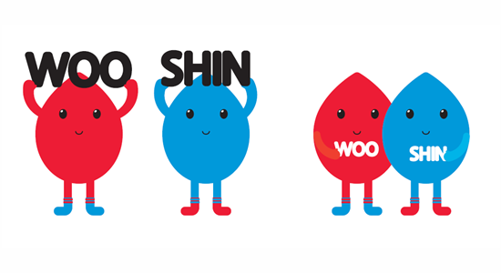
Our mascot is a pair of color droplets, a nod to what a pigment company makes. They wear Wooshin's signature red and blue, and appearing as a pair, they stand for friendship.
WOOSHIN Story, told by our mascots →